Wednesday, November 28, 2012

Naughty List

Welp, I've done it again. I've managed to make the naughty list again this year. I've been a crappy blogger this past month, boo! But the good news is, I've been really good at getting everything else done that I've been needed to do and putting off. But, I'm back. 

This past month was full of house closings on new constructions we've been working on, installs, and several projects coming to an end that we've been working on for months on end. I promise, promise, promise to get better about posting photos of projects we're working on. To tide you over, here's a dining room in-progress photo:


I also all finished my RSA Atlanta project, which was a huge task but SO much fun and SO rewarding. I was finally able to meet many local interior designers+bloggers that I had been meaning to connect with but never had a chance to. I won't share pictures quite yet, as there is a magazine in the works with professional photos, sourcing for furniture/accessories/finishes, etc. and I wouldn't want to spoil that! The project was followed by a wonderful wrap-party at MGBW:


 and then an open house so people could peruse Sam Bell Cottage and see everyone's work. I think I can speak for all the designers in saying that the entire experience finally set in during these two events (and not the last day of install like one might think!) because we all finally we able to relax, socialize, and take it all in. Here's an ultra-glamorous shot of me after a full day of painting and what I think was bronchitis (shout out to Liz& Mary for getting high off paint fumes and listening to me cough for 8 hours on a ladder!):


I took a few days off around Thanksgiving to spend time with this little bunny rabbit... (he's not cute at all, I know...) and recharge my batteries for the month of December! No better way to recharge batteries than piggy back rides, tickles, and an abundance of belly-laughs. Good Lord this baby just completes his Aunt Jem.


Now that December is here, the pressure is on again. Lots of projects are still outstanding and there is still lots of photography to be taken before the new year! It will feel great if we're able to wrap up everything and get photos so that we can start the year fresh..but we all know how that usually goes. My calendar is quickly filling up with Christmas parties, blogger events, design appointments, and just good ole' regular life stuff. I promised myself this year that I wouldn't let it overwhelm me, so I'm embracing the busy-ness (and the business) and am taking December by the horns. Now that all my priorities are straight (time donated for charities, toy boxes packed for children in need, food purchased for the food drive), I'm ready for everything else.  


So, a quick catch up: I'm asking Santa Clause for a nicer digital camera this year so I can share more photos with you that aren't from my century-old Crackberry, I just ordered new business cards that you can actually read (ordered a bulk amount previously and the text with tee-niny...which is Southern for tiny), and I hope to do a facelift to the blog early next year. Til' next time..

xoxox


Monday, October 15, 2012

Halloween Decor Done Right

 Happy Monday ya'll! That was done in my cheeriest Monday voice I could muster. I think I'm going to start posting these types of things on Mondays because they make me happy:


Anywho, I promised you guys last week I would show you some pictures of the decorating we did a few weeks ago for Halloween. We bought everything at the dollar store and used spray paint to customize, as usual.


"name your poison" lowballs for weekend festivites. 

entryway spider webs & pumpkin. 

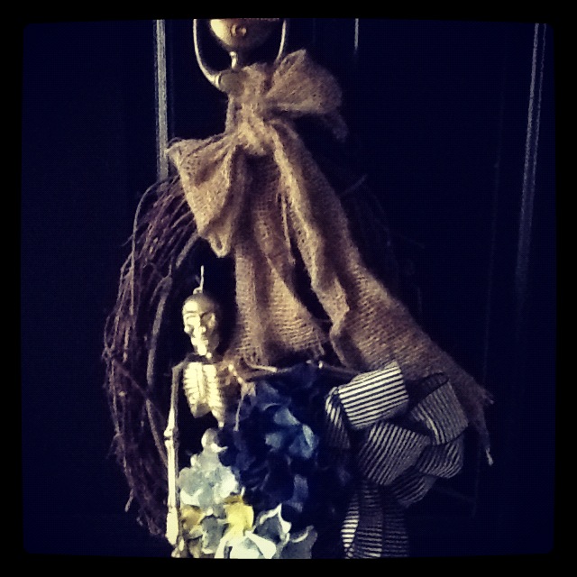
love. gold. skeletons. he's sitting up on our sugar. 

anddddd another greets you at our front door. 

oversized fishbowl with rope became the nest for gold-dipped spiders. kind of disgusting & kinda wonderful all at the same time. 


spiders in bar branches. 

i spy. [this one keeps freaking me out because i forget it's there..i'm a total chicken]

gold skull repeat. i have one in my room year round, it's not just a halloween treat anymore!
wouldn't be a holiday without leopard. 

hairbows and bowtie placemats. 

had to be sorta traditional, so here are some punkins...weenie style!  marley loves his silhouette with glitter. 


our weekend was filled with pumpkin carving  painting while we sipped on fall-inspired adult drinks (out of our poison cups, of course), spiced pumpkin cake, and lots of laughter with wonderful friends. I also got to stop by my old workplace and bring some treats for them while they got everything set up for the holidays. Not to mention, USC lost. Perfect weekend! The only thing that could have been better was a little Hocus Pocus. TV has been slow to get started with halloween this year and i'm having major problems with that.

keep calm and survive monday,

xoxox

Friday, October 12, 2012

Guest Post at Champagne Lifestyle on a Beer Budget

I'm happy to say that today I'm doing my very first guest blog post today for Hannah of  Champagne Lifestyle on a Beer Budget. I've followed her blog for quite some time, and was excited to be able to post for her while she's off to NYC.  If you don't already follow her, I suggest you put her on your blog roll-- it won't disappoint! I'm only a little jealous that her views are looking something like this:


and mine is looking like this:


See ya'll over there, and have a wonderful weekend!

xoxox

Tuesday, October 9, 2012

Fall Tablescapes

Entertaining is one of my absolute favorite things to do, especially this time of year! It's so wonderful to be able to have friends and family over to share some treats, drinks, and hopefully good laughs that you can remember year round. There's just something about this cold weather that makes us want to nestle together and enjoy loved ones' company. In fact, I'm having some close friends over this weekend to carve pumpkins, eat dinner, and watch a scary move to get us in the mood for Halloween. And by scary I mean Hocus Pocus..that's my jam! 

Today, I wanted to share with you some of my favorite tablescapes that I've pinned over the past few months. Most of them aren't geared specifically toward the holidays, but you could certainly add seasonal items to the mix. [i.e. white pumpkins, gold skeletons/skulls, pine cones, etc.] Sometimes it's nice not to be so focused on the season or theme, but just go with what feels right. Just like it's sometimes nice to see a Christmas tree decorated in bright colors, your holiday table can bring in that same feel without being super literal. Enjoy!

navy+maize+pink

the perfect fall table setting. i love the idea of the menus being tucked into beautiful napkins. it's just a small personal touch that will make your guests feel like they were truly planned for!

love this neutral setup.

moody and fallish with hop vines and mini pumpkins.

this is like a JA table setting..happy, bright, and chic. still brings in some of those colors that invoke the feeling of fall in us. 

fancy shmancy. 

add some white pumpkins and gold skulls...dunzo. 

these candles in wine bottles could give a cool spooky feel off at your table. 

1|2|3|4|5|6|7|8

Later this week, I'll be sharing with you some decor that we've put up around the house to get it feeling like fall. We used mainly champagnes, white, and gold..but are trying to figure out how to infuse a little orange or yellow in the mix. 

happy fall, time to go sweater shopping!

xoxox

Monday, October 1, 2012

Kitchen Design

Hey ya'll!

Wanted to share a picture that I posted on my Facebook today which got major love.  Thanks, everyone! It's from a recent new construction project our firm has been working on, and it's been my little baby for the past 6 months or so! I love this house so much and was so entrenched in every detail that I could practically rebuild it with no notes. Dedication..ha! 

Anyway, here's the photo I shared of the kitchen today:


I hardly ever post photos of what I work on with our clients & I can't begin to tell you why! Here's to me starting, promise.

I'll share a few more of my favorite highlights of the house later this week, so check back!

xoxox


Wednesday, September 26, 2012

Seagrass Flooring


Seagrass flooring is a favorite of mine, and I'll be using it on an upcoming project that I'm so excited to share with you guys! I'll keep this short and sweet, though. Seagrass is amazing because:

a. it's resilient, durable, and resistant to soiling due to it's waxy finish
b. under typical wear-and-tear for residential design, seagrass wears well for 10-15 years
c. it's less expensive than sisal 
d. the environmental impact of seagrass flooring production is minimal
e. it's a neutral palette and is flat enough to layer colorful rugs over it if needed
f. it's beeeeee-autiful

Some of my favorite applications:


the ceiling, the floor, the nook..i could go on. i would love those chairs  & ottoman in a bold, graphic pattern.
image via traditional home magazine

painted seagrass that will make you SWOON! my number one pick.
image via  veranda

masculine+soft
image via melanie turner interiors

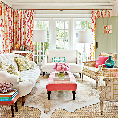
this sunroom makes my emotions soar (in a good way!) this was a close runner to my number one pick!
image via southern living

herringbone wall-to-wall seagrass provides great texture.
image via murchison-hume

besides that FAB gallery wall..this entry is a good example of entryway done right, complete with a seagrass runner.
image via lonny mag]

perfect resting place. [but insert marley on the pillow.]
image via pinterest, source unknown.

A quote that inspired me to have a different perspective today:

"Because in the end, you won't remember the time you spent working in the office or mowing the lawn. Climb that damn mountain." -Jack Kerouac
xoxox


Monday, September 17, 2012

PATCH NYC for Target

While I was shopping for some accessories the other day, I saw a new brand for Target that I hadn't seen before called PATCH NYC. The first thing I thought was "I live right across the street from Target. I have no excuse to have not seen this brand before!" It wasn't my fault..the line just launched starting September 9. I forgive myself. It was started and developed by two men, John Ross & Don Carney from Boston. They began with a hat collection & the brand has quickly blossomed into textiles, home decor, jewelry, fragrances, etc. Well, yeah, they literally have an Et Cetera category under their shop.

 I can say they were right on the money with their designs, as they have collaborations with fabulous stores like West Elm & Anthropologie. They also have a storefront in Boston, which I definitely want to visit next time I'm in the city galavanting around. [Joke. I wish!] Here are the goodies (and not all are at Target, so check out their website as well http://www.patchnyc.com/: 

faux bois done right. well...is there a way to do black & gold wrong?  it's tough.

insert Christmas cookies here. or keys. or mail.

in.love.with.this.    need.now.

classic fall stripes. 

simple.

love me some skulls! 

leopard plate goodness. 

modern twist of a candlebra. 

colors+elephant. 

this pheonix would do wonders for a place setting. 

Have an amazing Monday, ya'll!

As for me, I need to get it together. So much to do this week!
xoxox

Thursday, September 13, 2012

Room Service Atlanta: Deserving Design Delivered


Good morning all!

Two weeks ago, I was honored to be selected as an interior designer for this Fall’s Room Service Atlanta project. RSA is an organization that combines designers’ talents with a commitment to serve our community & those who need us. Read about the organization & our cause here. Last year, I served through RSA as a volunteer at the Nicholas House, Inc, a transitional home that provides families the opportunity to get back on their feet from homelessness & get on the route to self-sufficiency. In the couple short days I was there, I was able to see what an impact we all had on such deserving families. It was touching, inspiring, & certainly moved people to action here in Atlanta!


This year, there are a handful of designers that have been chosen to redesign rooms [bedrooms, private/public living areas] for the Sam Bell cottage at the United Methodist Children's Home in Decatur. This cottage houses UMCH’s Independent Living program, in which boys ages 18-21 who have likely been in and out homes & in the foster care system all their lives, are able to make the choice to stay, heal, and have an extra helping hand before they are out on their own.

I have chosen to help with a bedroom space, and am beyond excited! But…I could use all the help I can get! Our install is the week of October 22nd, so I have to get this project rolling and I need each and every one of you! Here’s how you can help me make this a wonderful & inspiring environment to our child in need:

I’m still in search of the following larger items: [For goods/services donations that I receive from you, UMCH will mail you a tax receipt.]
  •      Queen mattress & Bedsprings
  •      Flooring to go over the existing VCT tile
  •      Black queen-sized sheets
  •      IKEA gift cards for nightstands, desk, chair, pillows, duvet, curtains, picture frames, etc. 

Or to help me with some of the other items, you can donate money to help me complete my room (ANY little bit helps, I promise!):

1.Write a check to United Methodist Children's Home. In the memo, write "Sam Bell Cottage – Jennifer Baggett". Mail it to: United Methodist Children's Home, c/o Khalid Battle, 500 S. Columbia Drive, Decatur, GA 30030. 

2.  Donate online to United Methodist Children's Home by clicking 
RIGHT HERE. Be sure to designate the funds to Sam Bell Cottage: Jennifer Baggett or they won’t know who the money belongs to!

3.  If you'd like to donate products, need more information, or have any questions don’t hesitate to do the following:

Call/Text me: 770.584.6909
Tweet me: @jennbunnylynn
Send smoke signals if you must..anything to help! : )

Please let me know personally if you plan on making a check out or donating goods so that I'll know to look out for it and most of all, so I can thank you individually for your kindness. Also, if you’d like to volunteer your time/truck that weekend or week (for larger items like mattress, headboard, nightstands, etc), please let me know. Anything helps!

Thank you SO much for helping me transform this space into something to be loved!

Jennifer

Monday, September 10, 2012

Design Crush

I have the internets really bad today. [the girls and I coined the term 'internets' in design school for when you're super off-task and on the internet. it's when you can't.stop.looking.] I guess in the same respect, you could get the twitters, pinterests, or facebooks. But internets just sounds better. 

I love to look at other interior designers' websites to see what's happening in the world of photography. If I've heard it once, I've heard it a million times....'Don't turn over your work back to your client until you have taken your photos.' Don't fool yourself.. it will likely never be the same if you try to plan a photoshoot once they've gotten settled in. It is their space, right?! We as designers must plan accordingly for when we plan to get our shots, and it's extremely important to make them count. Does it make any sense for you to pour your heart into a design and then just take pictures as-is? We all know there are elements you must bring in to photographs that wouldn't normally be in a space. Do people usually keep their fur blanket quarter turned and laid over the back of the sofa? No. [Well, I keep mine perfectly folded and have mini-flipouts if people change it. But that's OCD, not real life.] Do they usually have fresh-cut flowers in every room? No. But in photography, it's all these details and elements that can make or break a shot. You want it to look lifestyled, not lifeless. You can also think of photography as you do an outfit: if you're showing a little more leg with a skirt, cover up your top with a blazer. You don't have to see it all! The worst photography shots, in my opinion, are those that are taken to show everything. If you love the fabric and legs on a chair, only show half. It creates visual interest, and it still shows off the parts that you love. If you have negative space on a console, crop part of that to bring the viewer's eye to the accessories. And please Lord don't just plop an accessory there just to have something; it's usually blatantly obvious once the photos are enlarged.Even when overall shots are taken, good photographers know not to show every corner of the room and every complete piece of furniture. Booooooring. 

Instead of taking hours to compile photos from a million different sources, I have just chosen one today that sparked this post. These shots are from Lizette Marie, a talented designer out of the San Fransisco Bay area who seems to have the styling aspect handled. I'll start with my favorite photo and go from there:


Cropping? Check.
Editing? Check.
Fresh flowers? Check.
Angles? Check.
Details? Check. 


If you're a designer out there, what are the essential things you always bring with you to a photoshoot for styling purposes and how much time do you spend gathering these things since they are an out-of-pocket expense? I am dying to hear your opinion! 

xoxox

want to follow me daily? twitter: jennbunnylynn