Tuesday, September 27, 2011

Delicious autumn! My very soul is wedded to it, and if I were a bird I would fly about the earth seeking the successive autumns.

George Eliot


Fall is in the air. Well, almost. I'm praying for it everyday, so...we'll see. Until then, I'm being inspired in the approaching change of season. Fall brings on some of my favorite things: the changing leaves, cool breezes, sweaters, orange, s'mores, trips to the mountains, fireplaces, etc. I just went and bought one of my favorite flavors of coffee, Starbuck's Cinnamon, and have been promising myself to run to Trader Joe's for a fresh bouquet of sunflowers for the dining table. My air-fresheners will soon be changed from fresh cotton to apple cinnamon and vanilla bean noel. Excited!!


So, as the saying goes, "Here are a few of my favorite things..."


Fall Wreath Feather Champagne Twirl Christmas Wreath
Feathers, feathers, and more feathers!
via LuxeWreaths


Fall Wreath - It's The GREAT Pumpkin Wreath with Burlap Bow - Original
Love the cute little pumpkin nestled in the wreath!
via TwoInspireYou


Fall Wreath for Front Door Decor - Orange and Cream Berry Wreath for Fall
Love the contrast against the dark door
via TwoInspireYou


Sunflower Wreath
Country Chic
via MelanieLeeDesign


And the winner is..........
Year Round Wreath - Sassy Girl Wreath with Leopard Print Bow

Leopard and fall? Hands down.
via TheWrightWreath


Ok...this was a long shot, but the fall reminds me of carnival (see above picture), which reminds me of Water for Elephants, which reminds me of Robert Pattison. Rawr. :)
via Google


via usatoday


via kidspacestuff


via design-seeds


via blogs.babble


via hiphipgingin


via Inspired By This


via Jenny Steffens


via Donna Rietheimer


via Ruffled Blog


via Pottern Barn


via Pottern Barn


via Could I have That


via h&m


via Old Navy  


via Martha Stewart


via Polyvore


via WhoWhatWear


via Mandi Cresswell


via Hermes


1.  listen to Adele 2. read Water for Elephants 3.get a warm fleece blanket to cuddle up with


Enjoy the changing seasons, and embrace it as a time where you too can change. 


 Goodnight! 


Saturday, September 24, 2011

Pink and Gold love: Idea Room

I've been thinking about fall this morning as I sip my cinnamon coffee..delish! When looking for fabric for a client's home this week, I was inspired by some bright pink silk that I stumbled upon. Don't get me wrong, I love the typical colors of fall--browns, reds, oranges, etc.-- but I'm thinking I want to try something different this year. Of course I won't redecorate my whole house...but if I could....I think I would go hog-wild with some pink, gold, and yellow. And by hog-wild, I mean seriously take it over the top. One thing that I have seen that is crazy is how often people only have a dining table, chairs, and buffet in their dining room. What makes it crazy is that a lot of these homes are hugeeee that I see this trend in, and they have crazy big dining rooms! Why waste all this space just because it's the 'traditional' thing to do?? Not this girl! Every time I have been to a wedding/baby shower at someone's house, we do the best we can to grab all the dining chairs and barstools and scatter them around a living room area and uncomfortably eat. Uncomfortable=eating on a white sofa, eating in a slipper chair, eating in a dining chair with no side table, etc. Do you know what I mean now? It's just plain uncomfortable to attempt to socialize while you're worrying about your plate slipping off your lap or someone kicking your red wine over because it's on the floor.

So, here's what I'm thinking. Why not pull in some extra seating and side tables into the dining room if you have the space? I want the dining room to be about socializing. I mean, it is one of the rooms people tend to spend the most money on in their house but it's so underused. I pulled together a scheme to show you the main area plus a table setting, as well as an accent wall opposite that hot settee. It took a little bit too long (like forever) to do it, but I'm loving the finished product. Great, now I'm totally unimpressed with my dining space! Maybe I can find a client this fall who wants to use this color scheme?? Do you love?


Be inspired!


Image One:
a. bamboo chair via Grant K Gibson for One King's Lane
b. gold velvet settee via Eric Cohler for Lee Jofa
c. wallpaper via Harlequin
d. pink drapes via EBAY
e. horn chandelier via Mattermatters
f. faux bois gold stool via EBAY
g. glass table via bdbarcelona
h. flowers via Black Band Home and Design
i. rug via ABC Carpet and Home
j. elephant via Grant K Gibson for One King's Lane
k. chair via Vamp Furniture
1. napkin ring via Gifted Solution
2. china via Pure Modern
3. lacquer bowl via Furbish Studio
4. flatware via Ricci Silversmith for Neiman Marcus

Image Two:
a. gold mirrors via 1st dibs
b. white and gold chain tray via Dekado Home Decor
c. sideboard via 1st dibs

Thursday, September 22, 2011

WHOA! Wallpaper

I'm going to start off by not apologizing for the abundance of pictures that this post will contain. I was thinking about what I wanted to post about this morning while on the way to get Marley's blood drawn for some tests (poor baby!) Of course, I needed a little distraction while sitting in the waiting room thinking about how mad he was going to be that I didn't get to go back with him. (If you think I'm kidding, I'm not. His nickname at the vet is 'guilt trip'... they know him quite well!)

So, I'm waiting and thinking. Well, my parents have been considering doing some projects that would give their house a little facelift. They have replaced the old beige, boring carpet with a salt-and-pepper-esque frieze carpet (I totally didn't like it from looking at the swatch, but it looks great installed!) and medium-tone maple wood flooring. One of their biggest challenges is making a commitment. Prime example (and feel free to judge): They have lived in that house for 13+ years and still.do.not.have.any.curtains. Yes, I said it. They did, however, have some beautiful winter white wooden blinds installed-so this is halfway there! Commitmentphobes with an interior designer as a daughter- this is a travesty. I need about three seconds to make a commitment with design, I know what I like right when I see it. Design confidence. I gifted them some beautiful Belgian linen curtains last year for Christmas, and they're in the closet. Waiting. Waiting. Waiting on what?? Give me a ladder and move aside! Onward..

One thing that my mom cannot stand is the presence of the awful wallpaper in our house. Whoever lived there previously had horrible taste, and it was only made worse that they lived there in the 90's. Floral wallpaper with stripes, that's all I will say. Kitchen and two bathrooms, ruined. The kitchen is wallpapered in a hunter green and maroon tiny-scaled floral. First of all, hunter green and maroon?? Please, someone get me a fork to gag myself with. They painted the chair rail with what appears to be a hunter green chalkboard paint...hmmm. And to top it off... green polyester balloon valences stuffed with Walmart bags (those were removed immediately, promise!) Needless to say, I'm sure I've conjured an image in your head that you have to shake to get rid of...and quick! Point is- the wallpaper has to go, the chair rail needs to be painted, the cabinets are screaming for some new wallpaper, and the 90's called to reclaim their plastic laminate countertops. The bathrooms are begging to be stripped and painted, and it's going to happen.

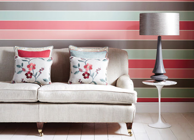
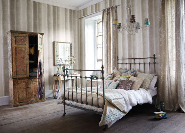
This got me thinking...wallpaper. For a long time, before I really knew what products were out there, I was completely against wallpaper anywhere. In my head, I just always saw that green and maroon and couldn't get past it. But with further investigation in design school and now the design world, I now know that wallpaper can be drool-worthy if you look in the right places. It can also inspire the design for a room, or even a whole house, if you pick something with enough personality. In school, I relied on Harlequin, a company based out of the UK, to give me some of the most unique and bold patterns to compliment my design style. They ship free samples (Hallelujah Harlequin!) and have a scrapbook portion of their site where you can look at the wallpaper application and even create mood boards. It also helps that they show equally drool-worthy furniture in front of the wallpaper. I decided to revisit this website, and was quickly reminded why I had such a die-hard crush on them!


See..I told you, right?! To die for! Here are some other beautiful applications from different sources:


Sometimes I think it is really hard to go wrong with geometric patterns! 


Look at the contrasting piping on the chairs.


I LOVE this moody bedroom!


Ok...so I think almost anything with chevrons is pure genius. But look at this wallpaper! 


From the Land of Nod- wallpaper that your children can draw on. Come on! 


 A living room by Michelle Adams- lucite table, chevron curtains, bamboo mirror, and freakin' ostrich wallpaper. Totally works! 


Another company you need to know about- Madison and Grow. Based out of LA and they keep the environment in mind when designing their wallpaper and textiles!


Funky and fresh- perfect for a teenage girl's room!


Retro floral with an iron bed, and what looks to be a beautiful view. 


Classic black and white stripes. Enough said. 


If I was a guy and had a studio, it would get this newspaper wallpaper application.


Stark white with black, yellow, and metallic accents? MMk. 


Kelly Wearstler for VOGUE. Worship! 

Hope everyone is having a productive and beautiful Thursday!